The button card on the Reading tools tab designs your Accessibility button, with a live preview beside it. Every choice is drawn in the preview as you make it; press Save to put it on your site.
Where to find it:
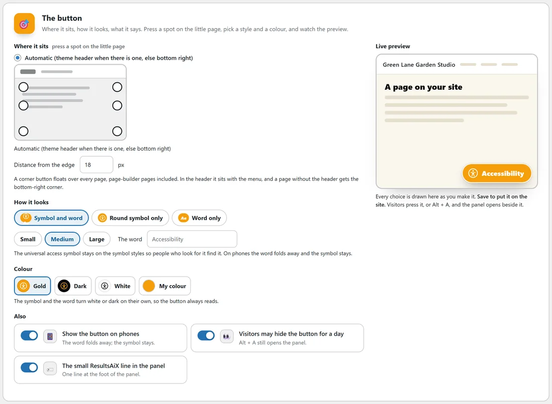
Open AiX Accessibility, Reading tools, and scroll to the card called The button. The settings are on the left and the Live preview is on the right, drawn with your site's name.
Where it sits:
Press a spot on the little page, or choose Automatic. The name of the spot you picked shows under the little page.
- Automatic (theme header when there is one, else bottom right): in the theme header when your theme offers one (the ResultsAiX Theme does), otherwise the bottom right corner.
- In the site header: offered only when the ResultsAiX Theme is active. On a page that does not print the theme header, the button uses the bottom right corner instead.
- Bottom right corner, Bottom left corner, Top right corner or Top left corner.
- Right edge, middle or Left edge, middle.
A corner button floats over every page, page-builder pages included, and the panel opens beside it.
Distance from the edge:
How many pixels the button sits from the edges of the screen, from 0 to 120. It starts at 18. On screens 820 pixels wide or narrower the button uses 14 pixels, whatever you set, to save space.
It stays clear of other bars:
If something fixed to the same edge of the screen would cover a corner button, such as a cookie notice, a sticky footer or a countdown bar at least 300 pixels wide, the button moves to sit clear of it and moves back when the bar goes. That includes a cookie notice that slides in a moment after the page has loaded. The button also steps clear of the other ResultsAiX corner buttons, such as the AI help button and the ResultsAiX Pulse chat bubble. A button on the middle of an edge stays where it is.
How it looks:
- Style: Symbol and word, Round symbol only, or Word only.
- Size: Small, Medium or Large.
- The word: what the button says, up to 30 characters. Leave it blank for Accessibility. The same word titles the panel and appears on the reading bar's panel button, so you can use your own language.
The universal access symbol stays on the symbol styles so people who look for it find it. On screens 820 pixels wide or narrower the word folds away and the round symbol stays.
Colour:
Gold, Dark, White, or My colour, which opens a colour picker for any colour you like. The symbol and the word turn white or dark on their own, so the button always reads.
Also:
- Show the button on phones: on by default. Switch it off to hide the button on screens 820 pixels wide or narrower.
- Visitors may hide the button for a day: on by default. Adds Hide the button for today to the foot of the panel. Alt + A still opens the panel while it is hidden.
- The small ResultsAiX line in the panel: on by default. One line at the foot of the panel. Switch it off to remove it.
A real example:
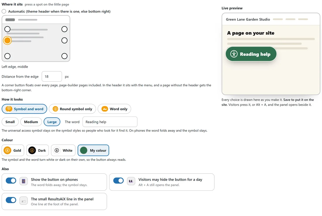
Green Lane Garden Studio has a green brand. Maya presses the Left edge, middle spot, picks Symbol and word and Large, types Reading help as the word and chooses My colour with her brand green. The preview shows a large green Reading help button, and the symbol and word turn white on their own because the green is dark. She presses Save and the same button appears on her site.
Good values:
- Most sites: Automatic or Bottom right corner, Symbol and word, Medium, Gold or your brand colour.
- Sites with a chat bubble in the bottom right: Bottom left corner.
- Sites with very little room: Round symbol only.
Tips:
- Pick a word your visitors will look for. Accessibility, Reading help and Easy read all work well.
- If you place the button in the middle of an edge, check that it does not cover your own content on narrow screens.
- The same settings are carried into the one-line embed. See PRO: On Any Page, Any Domain, With One Line.