The blog is where most visitors meet your site. The theme gives you four ways to lay out the post list, a sliding banner of your best posts above it, and an article page built for reading, with related posts at the end so readers keep going.
Where to find it:
- ResultsAiX Theme, Blog: the sliding banner and the blog page settings.
- Appearance, Customize, ResultsAiX Theme, Blog layout: the layout everyone sees first.
- Settings, Reading in WordPress: which page is your posts page.
The four blog layouts:
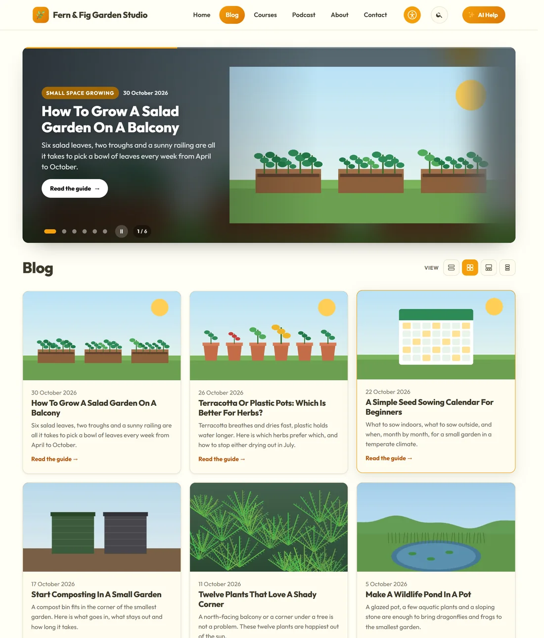
- List: posts one under another with a picture beside each.
- Card grid: three-across cards.
- Magazine: a featured post on top, then a grid.
- Classic: a narrow centred list.
Pick one in the Customizer under Blog layout. Search results and category pages use the same card style.
Let visitors choose:

On Blog, The blog page, tick Let visitors choose the blog layout. Four icons appear beside the page title: List, Cards, Magazine, Classic. A visitor's choice lives in their own browser and is applied before the page paints, so there is no flash of the wrong layout. Nothing is stored on your site.
The blog page settings:
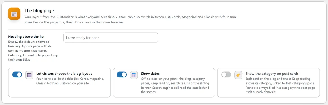
- Heading above the list: empty, the default, shows no heading. A posts page with its own name uses that name. Category, tag and date pages keep their own titles.
- Show dates: on by default. Off removes the date from your posts, the blog, category pages, Keep reading, search results and the sliding banner. Search engines still read the date behind the scenes.
- Show the category on post cards: off by default. On, each card on the blog and under Keep reading shows its category, linked to that category's page.
Press Save Blog.
The sliding banner:
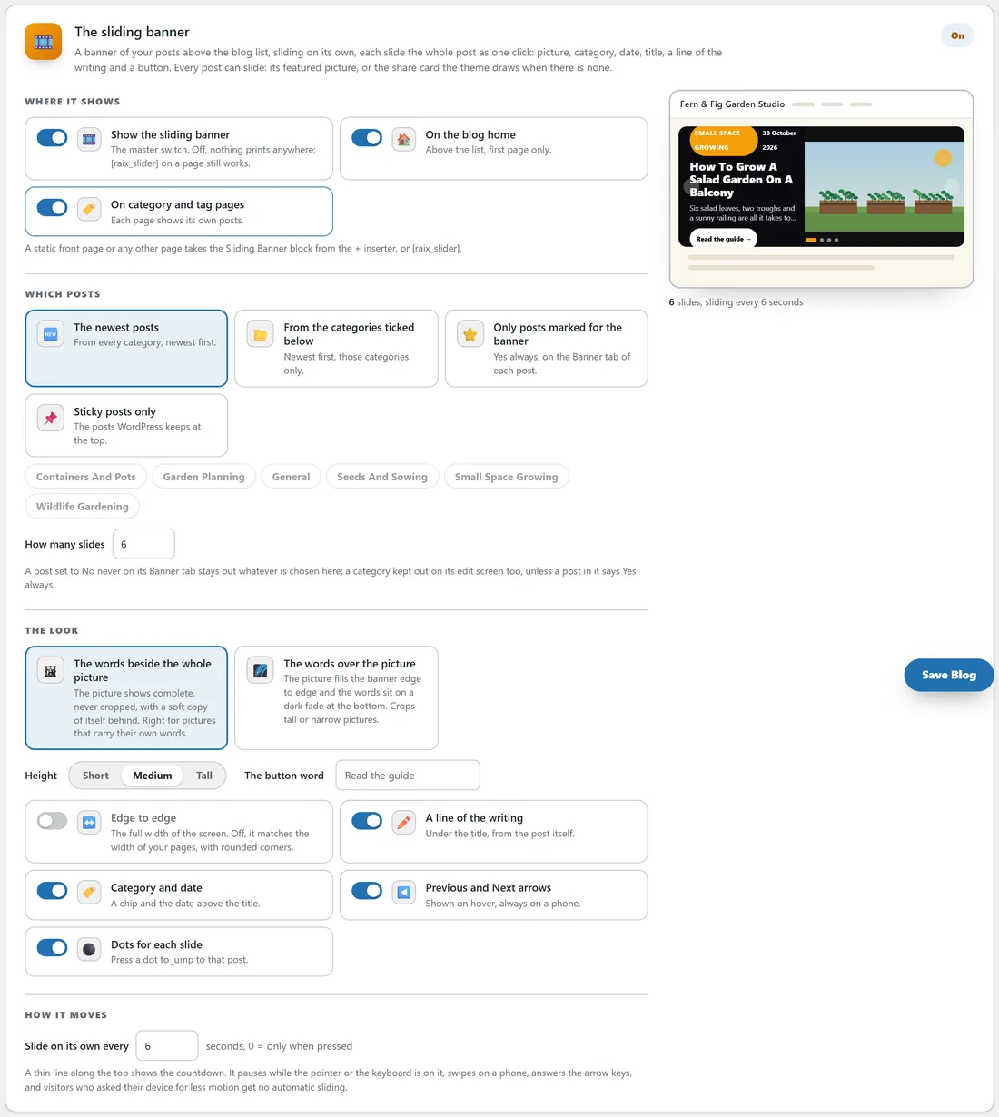
A banner of your posts above the blog list, sliding on its own. Each slide is the whole post as one click: picture, category, date, title, a line of the writing and a button. Posts with no featured picture use the share card the theme draws for them.
Where it shows:
- Show the sliding banner: the master switch. Off, nothing prints anywhere, though the shortcode on a page still works.
- On the blog home: above the list, first page only.
- On category and tag pages: each page shows its own posts.
A static front page or any other page takes the Sliding Banner block from the + inserter, or [raix_slider].
Which posts slide:
Pick one: The newest posts, From the categories ticked below, Only posts marked for the banner, or Sticky posts only. Then set How many slides. A post can choose for itself on the Banner tab of its ResultsAiX panel: Site default, Yes, always, or No, never.
The look and the movement:
- The words beside the whole picture (the picture shows complete, never cropped) or The words over the picture (edge to edge, words on a dark fade).
- Height: Short, Medium or Tall. The button word. Edge to edge, or the width of your pages with rounded corners.
- Switches for A line of the writing, Category and date, Previous and Next arrows and Dots for each slide.
- Slide on its own every so many seconds, 0 for only when pressed. It pauses while the pointer or the keyboard is on it, swipes on a phone, answers the arrow keys, and visitors who asked their device for less motion get no automatic sliding.
The live preview at the bottom of the card follows every choice. Press Save Blog.
The open article:
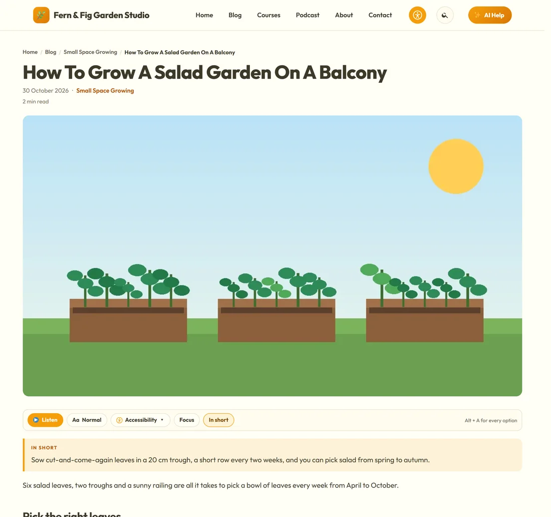
A post opens with breadcrumbs, the title, the category, the date and the reading time, then the featured picture shown whole in its own shape. Under the picture sits the reading bar (Listen, text size, Accessibility, Focus and In short). At the end of the post come the share buttons, the author box and Keep reading.
The author box:
The author box shows the whole Biographical Info from the author's WordPress profile, with links working. In Users, Profile, Your links in the author box, each author can add a Website, Amazon author page, Facebook, X, LinkedIn, Instagram, YouTube and TikTok.
Keep reading:
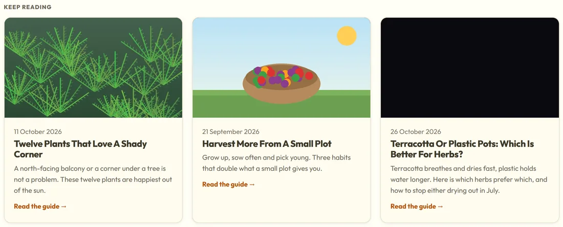
Three related posts appear at the end of every post, from the same section first, then the newest.
Links in your writing:
Links inside posts and pages carry colour and weight rather than an underline, and a heading that is itself a link keeps the heading's colour.
On a phone:
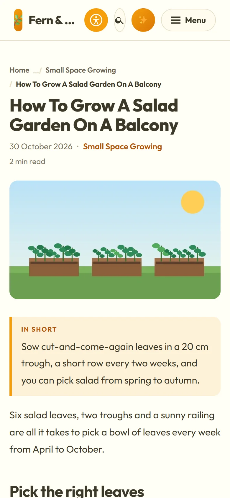
The header becomes a Menu button and a Search button, the post fills the screen, and the reading bar sits along the bottom.
A real example:
Jo uses Card grid on yoursite.com, with the view switcher on so readers who prefer a list can have one. The sliding banner shows the six newest posts with The words beside the whole picture, because Jo's pictures are illustrations that should not be cropped. The salad post is set to Yes, always on its Banner tab so it always opens the banner.
Tips:
- Give every post a featured picture. It leads the card, the banner and the share card.
- Turn dates off for evergreen guides that should not look old.
- Next, add share buttons and share cards. See Sharing: Share Buttons, Share Cards, The Post Picture And Site Search.