The Design tab keeps the choices short on purpose. A campaign that matches your site converts better than one that shouts.
Where to find it:
Open a campaign in the builder and click the Design tab. The groups are Colours, Shape and motion, Placement, Mobile, and for a Content Locker, What to lock.
Colours:
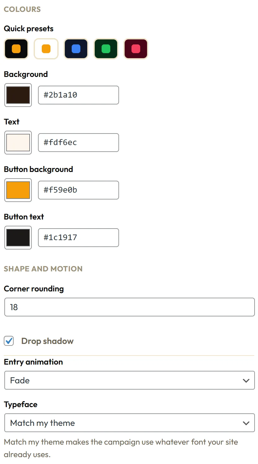
Start from a Quick presets swatch. Each one sets all four colours at once. Then fine tune any of them:
- Background
- Text
- Button background
- Button text
Click a colour square to pick, or type a hex code such as #2b1a10 in the box next to it.
Shape and motion:
- Corner rounding: 0 for square corners, up to 40 for very round.
- Drop shadow: on or off.
- Entry animation: Slide, Fade, Zoom, Bounce or None. The In-Content Box has no animation, because it is part of the page as it loads.
- Typeface: Clean sans serif, or Match my theme to use the font your site already uses.
Placement for bars:
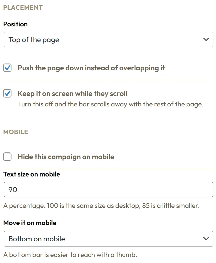
- Position: Top of the page or Bottom of the page.
- Push the page down instead of overlapping it: on by default, so a top bar never covers your logo. The Floating Bar starts with it off, because floating is its point.
- Keep it on screen while they scroll: on keeps the bar fixed, off lets it scroll away with the page.
Placement for other families:
- Sticky Side Tab: Side, Right edge or Left edge.
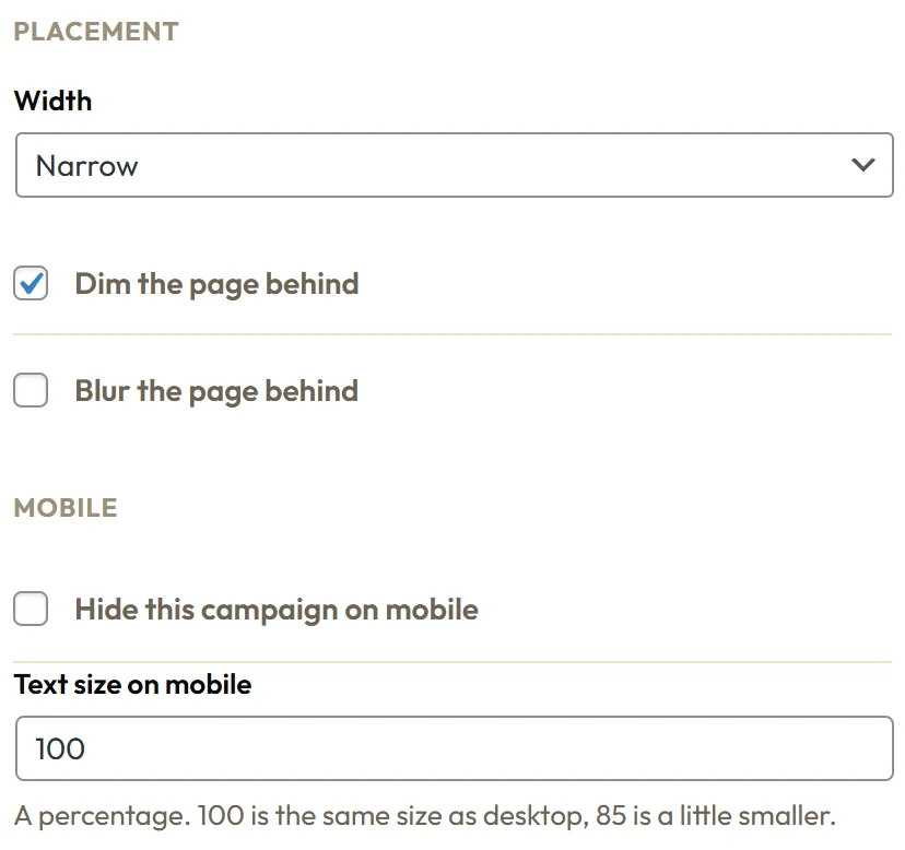
- Popups: Width, Narrow, Medium, Wide or Full width, plus Dim the page behind and Blur the page behind.
- Slide In: Corner, Bottom right, Bottom left, Top right or Top left.
- Side Drawer: Side, Right or Left.
- Sheet: Edge, Bottom or Top.
- In-Content Box: Show after paragraph and Content area. See The In-Content Box.
Mobile:
- Hide this campaign on mobile: hides it on phones.
- Text size on mobile: a percentage. 100 is the same as desktop, 85 a little smaller.
- Move it on mobile, for bars: Same edge as desktop, Top on mobile or Bottom on mobile. A bottom bar is easier to reach with a thumb.
What to lock:
For a Content Locker, Content to blur takes a CSS selector such as .entry-content. Leave it blank and Engage finds your article by itself.
A real example:
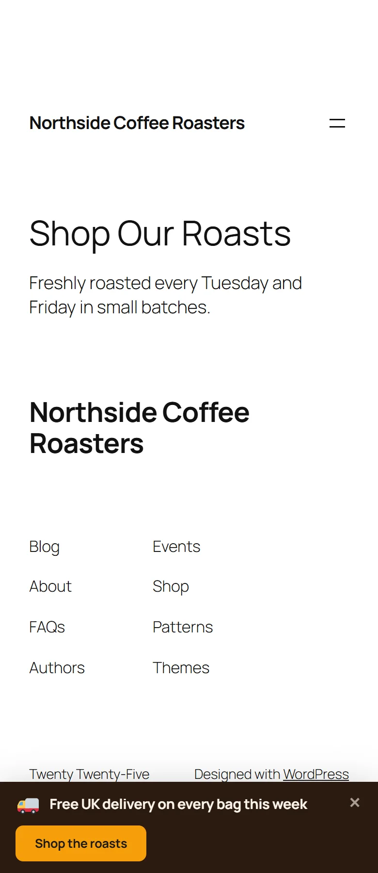
Northside's Free Delivery Bar uses a dark roast brown background #2b1a10, cream text, an amber button, square corners and Slide. On phones it moves to the bottom with Text size on mobile at 90, so it sits under the thumb and never covers the menu.
Respecting every visitor:
If a visitor's device asks for reduced motion, Engage drops its entry animations for them. Popups can be closed with the Escape key, keyboard focus stays inside an open popup, and focus returns to the page when it closes.
Designing for conversions:
- Contrast first: the button should be the brightest thing in the campaign.
- One accent colour: use it for the button and nothing else.
- Corner rounding: match your site. Square sites look best at 0 to 4, friendly sites at 12 to 18.
- Animation: Slide for bars, Fade or Zoom for popups. Bounce draws the eye, so save it for one campaign.
- Width: Narrow for a single email field, Medium for most popups, Wide for a video or several fields.
- Dim the page behind keeps attention on the popup. Blur the page behind adds a soft finish.
- Typeface: Match my theme makes campaigns feel like part of your site.
A mobile checklist:
- Switch the Live preview to Mobile.
- Check the headline fits on two lines or fewer.
- Lower Text size on mobile to 85 or 90 if it does not.
- For bars, try Bottom on mobile under Move it on mobile.
- For large popups, consider Hide this campaign on mobile and a Sheet or Slide In for phones instead.
Tips:
- Use your own brand colours for the button background, and keep the text dark on light or light on dark.
- Check the Mobile preview after every design change.
- Hide a Welcome Mat on mobile and run a Sheet or bar there instead.