Every campaign is edited in one screen, the builder. Learn it once and every campaign type works the same way.
Where to find it:
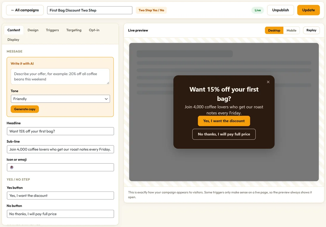
Campaigns tab, then click a campaign name or its Edit button. A new campaign opens in the builder automatically.
The bar across the top:

- All campaigns takes you back to the list.
- The name box: click it and type to rename the campaign. Visitors never see this name.
- The type label, for example Two Step Yes / No.
- The status, Draft or Live.
- On a draft: Save Draft and Save & Publish.
- On a live campaign: Unpublish and Update. Update saves and keeps it live. Unpublish saves and takes it off your site.
If you try to leave with unsaved changes, your browser asks you first.
The six tabs:
- Content: the words, buttons and every field that belongs to your type
- Design: colours, shape, animation, placement and mobile
- Triggers: when it appears
- Targeting: where, and for whom
- Opt-in: turn it into an email capture and choose where leads go
- Display: how often, priority, embedding and split testing
The Content tab changes with the type:
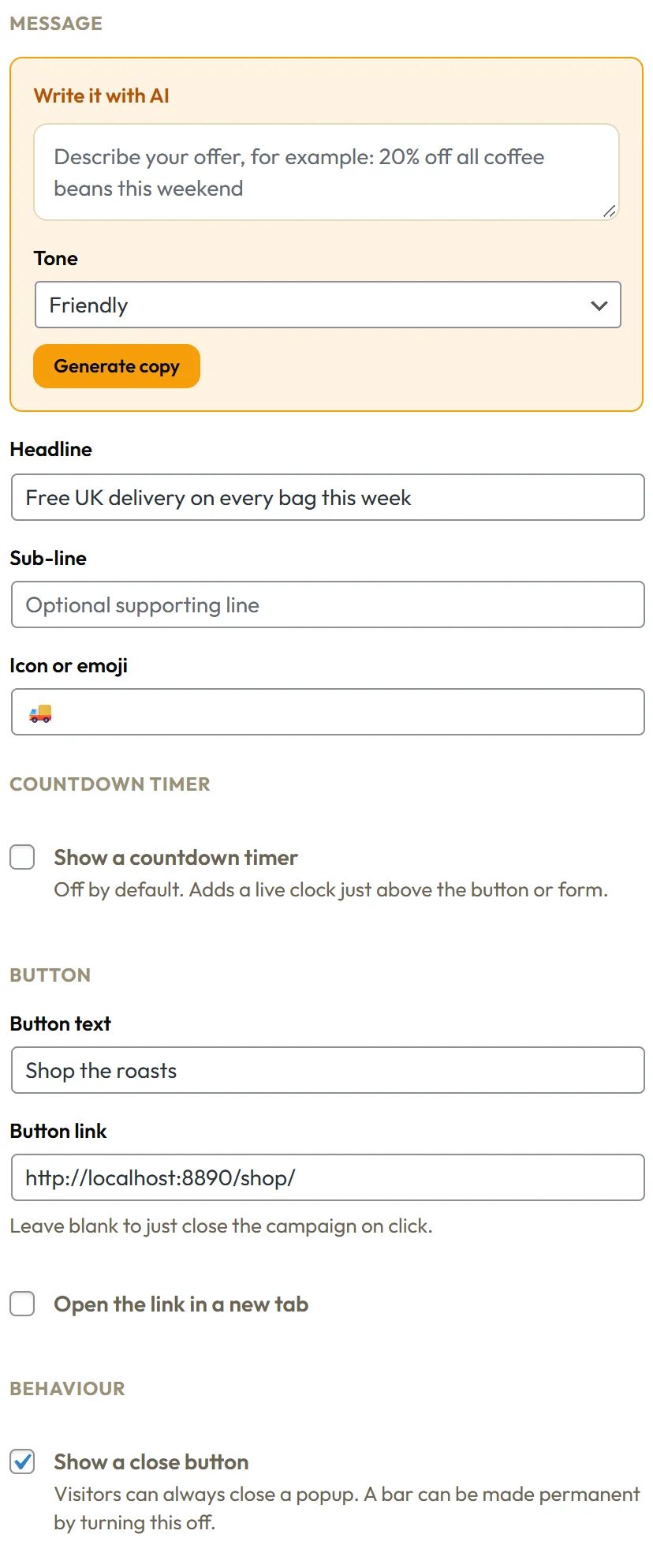
Most types show a Message group with Headline, Sub-line and Icon or emoji, then a Countdown timer group, a Button group and a Behaviour group with Show a close button. The rest adds what that type needs:
- Split Bar: How many columns, then Icon, Headline, Sub-line, Button text and Button link for each column
- Announcement Ticker: Messages, one per line, up to 10
- Chat Bubble Callout: Name shown at the top, Avatar image URL and Messages, one per line
- Coupon Reveal Bar: Reveal button text and Coupon code
- Video Popup: YouTube or Vimeo URL
- Two Step Yes / No: Yes button and No button, plus Where Yes goes
- Entry Gate: Enter button and Leave button
- Cookie Notice Bar: Accept button and Decline button
- Spin To Win: Prizes on the wheel and a Losing message
- Sticky Side Tab: the Button text field is called Tab label
When a campaign collects emails, the Button group explains that the form's own submit button is used instead. You word that button on the Opt-in tab, in Submit button text.
Content tab examples:
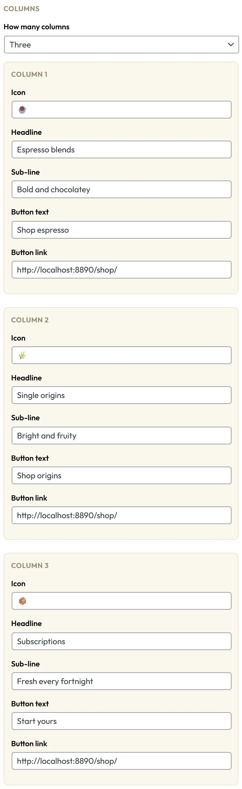
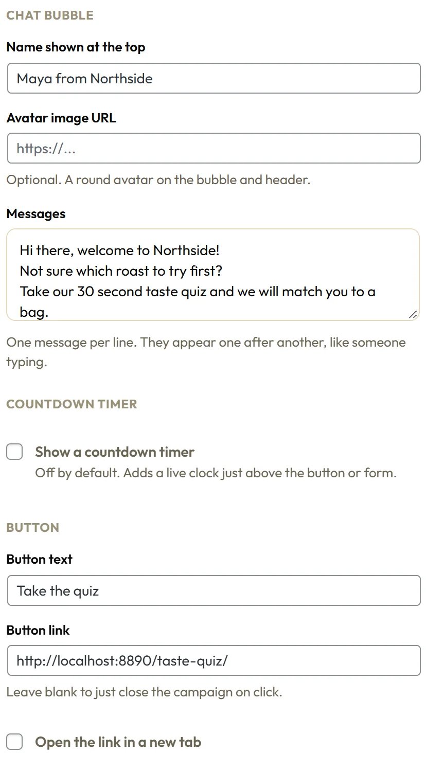
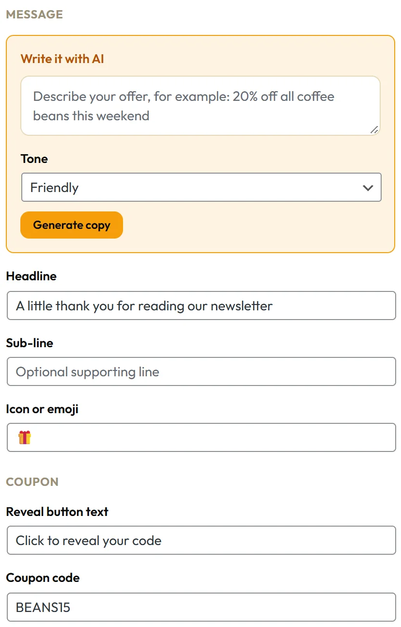
The Free Delivery Bar shows the standard groups. The Split Bar shows a column editor, the chat callout a message list, and the coupon bar a code field.
The live preview:
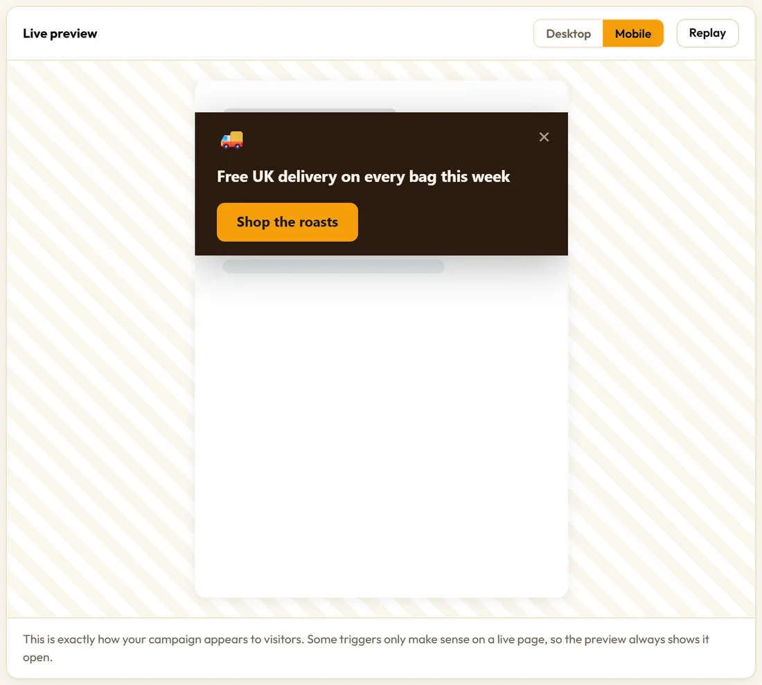
The Live preview draws your campaign with the same stylesheet and the same code your visitors get, so there is no guessing. Use the Desktop and Mobile buttons to switch size, and Replay to play the entry animation again. Because some triggers only make sense on a real page, the preview always shows the campaign open.
Saving:
Save often. Engage cleans every setting on the server before storing it, so a campaign built on an older version always picks up new settings with sensible defaults.
A real example:
To change the Free Delivery Bar to a weekend message, Northside opens it, edits the Headline, checks the Mobile preview, and clicks Update. The change is live straight away and the numbers keep counting.
The common Content fields:
- Headline: the main line, in large type. One promise, ideally under ten words.
- Sub-line: one supporting sentence. Optional.
- Icon or emoji: shown beside or above the headline. Paste any emoji.
- Button text and Button link: the call to action. Leave the link blank and the button simply closes the campaign.
- Open the link in a new tab: keeps your page open behind the new one.
- Show a close button: under Behaviour, on by default. On a popup it also lets visitors close it with the Escape key or a click on the dimmed page, so leave it on for popups. Untick it on a bar to make the bar permanent. A Content Locker and an Entry Gate never have a close button, which is the point of them.
Building a campaign tab by tab:
- Content: write the words first, because everything else serves them.
- Design: pick a preset close to your brand, then adjust Background and Button background.
- Triggers: choose the moment.
- Targeting: choose the pages and the people.
- Opt-in: switch it on if you want emails, and choose where they go.
- Display: set how often, and the priority if you run several popups.
- Check Desktop and Mobile in the Live preview, then Save & Publish.
Tips:
- Rename campaigns so the list reads well, for example Brew Guide Exit Popup.
- Use Mobile preview before publishing anything with long text.
- Next, read Triggers: When A Campaign Appears.