The Look and Feel panel sets how every slide in an AI Deck is drawn. The Preview beside it changes as you go, and the room uses exactly the same drawing, so what you see is what attendees get.
Where to find it:
Content tab, Look and Feel panel, beside the Images panel.
Every setting:
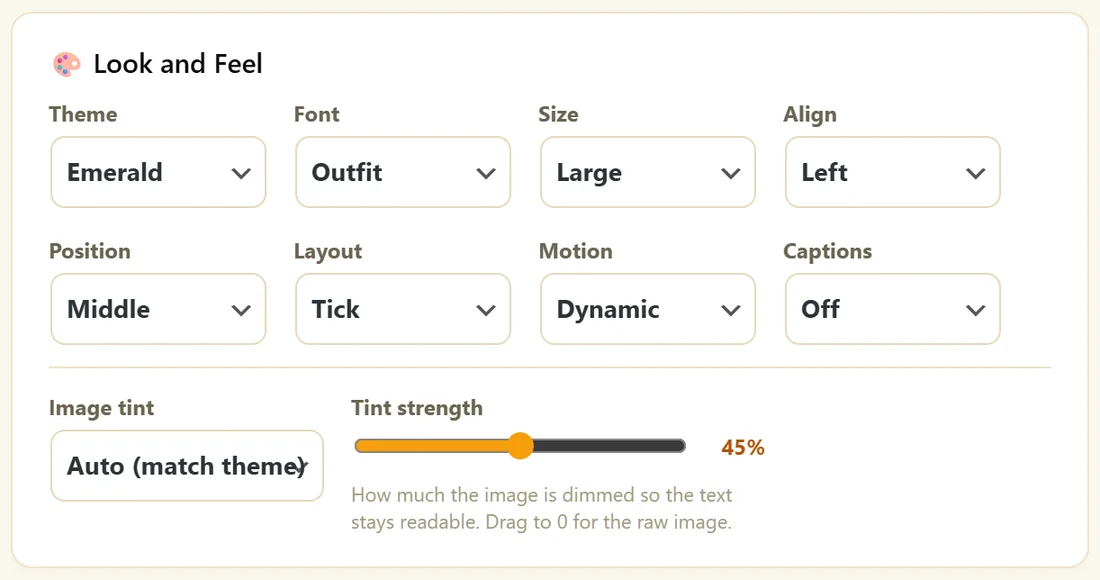
- Theme: Ink, White, Ocean, Emerald, Violet, Crimson, Midnight or Gold. Each sets the background, text and accent colours. A registration page on Match My Webinar follows this theme.
- Font: Outfit, Montserrat, Oswald, Anton, Playfair, Roboto Slab, Georgia, Arial or Impact.
- Size: Small, Medium, Large or X-Large. Large suits most decks.
- Align: Left, Center or Right.
- Position: Top, Middle or Bottom.
- Layout: Tick, Bar, Underline, Panel or Plain. The accent mark drawn with the text.
- Motion: Dynamic, Subtle or Off. A gentle zoom and the text appearing in steps.
- Captions: Off or On. On puts the text in a caption block, which reads well with the sound off.
- Image tint: Auto (match theme), Dark or Light. How a slide image is dimmed behind the text.
- Tint strength: a slider. 0 shows the raw image.
Automatic emphasis:
You never format words by hand. Any word with a digit, a dollar sign or a percent sign is drawn in the accent colour, and so are power words such as free, new, proven, guaranteed, instant, easy, fast, today, results, you and your.
Slide images:
Under each slide card, describe a picture and click AI image, or click Upload to choose from your Media Library. The slide redraws with the picture behind the text. The cross removes it. See Generating Slide Images.
One background for the whole deck:
In the Images panel, Background image sets one picture behind every slide. Upload it, describe it and click AI image, or click Upload to pick one. Any slide with its own image keeps that image. Apply to every slide copies the background onto every slide as its own image, and asks first because it replaces images you set one by one.
Previewing:
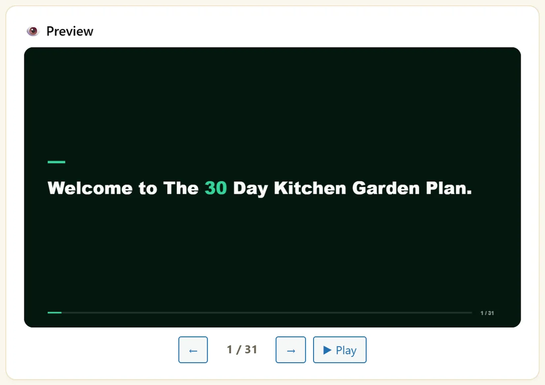
Step through with the arrows in the Preview panel, or click Play to run the deck.
A real example:
Maya's Kitchen Garden Plan uses Emerald, Outfit, Large, Left, Middle, Tick and Dynamic, with tint on Auto at 45 percent. "Here is the promise: a full salad bowl from your own pots in 30 days." shows 30 in green without her doing anything.
Tips:
- Dark themes with Large text read best on phones.
- Turn Captions on for webinars people watch at work.
- Next: Generating Slide Images.
Good starting looks:
- Coaching and lifestyle: Emerald or Gold, Outfit, Large, Left, Tick, Dynamic
- Business and software: Ink or Ocean, Montserrat, Large, Left, Bar, Subtle
- Bold sales decks: Midnight or Crimson, Anton or Oswald, X-Large, Center, Underline, Dynamic
- Calm teaching: White, Georgia, Medium, Left, Plain, Off
Pairing the deck with the registration page:
With Match My Webinar on the Registration tab, your theme also picks the registration page style. Change the theme and the page follows, so your ads, page and room look like one brand.
Using images well:
- Keep one style across the deck. Set it once in Direct The AI Images.
- Use pictures on the slides that matter most: the promise, each step and the offer.
- If text is hard to read on a busy picture, raise Tint strength.
- Set Image tint to Dark on dark themes and Light on White.
Captions or not:
Captions On puts each line in a caption block near the bottom, like subtitles. It reads well for people watching at work with the sound off. Off gives you the full layout with the accent mark.
Checking on a phone:
Open your registration page link on your phone, sign up, and watch a minute of the room. Large text in the Middle position reads best on small screens.
What to do next:
- Generating Slide Images
- The Webinar Room And Live Chat, to see the deck as attendees do
Common questions:
Can I change the look after narrating?
Yes. Theme, font, size and layout changes do not affect the narration, so nothing needs narrating again.
Does the room look exactly like the preview?
Yes. The room uses the same drawing as the Preview panel.